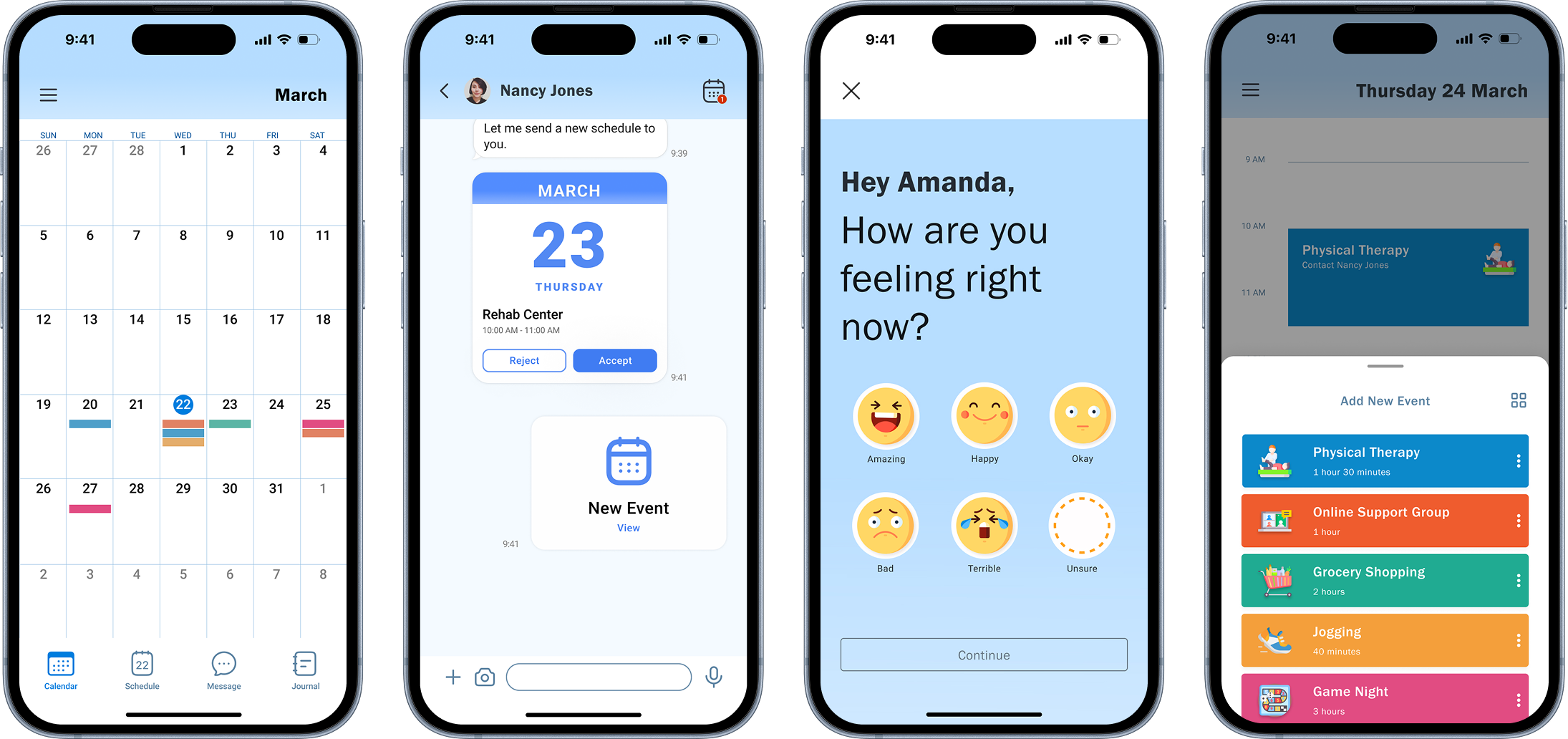
In collaboration with CreateAbility, Inc., we designed a planning and scheduling app to support individuals with Traumatic Brain Injury (TBI). The goal was to address memory and decision-making challenges through a simple, research-informed tool.
As the UX Designer, I led secondary research to help the team understand TBI symptoms, planned the research approach, conducted user interviews and usability tests, and contributed to ideation, sketching, and prototyping.
I explored academic papers, workbooks, PST worksheets, and a coaching audio recording to understand the process and users. I also interviewed clinical experts to learn about common challenges people with TBI face during training.
We interviewed individuals with TBI, stroke survivors, caregivers, and experts to understand decision-making and planning challenges. While our client prioritized decision-making, users were more affected by memory issues. Many relied on notes to compensate for memory loss, and planning often needed to happen well in advance. Experts suggested exploring impulse control, and some users mentioned mood tracking as helpful.
To uncover more detailed challenges that interviews alone couldn’t capture — due to memory gaps — we conducted a 15-day experience sampling. Participants shared diary entries and app screenshots, revealing personal strategies like color-coded calendars, repeated daily to-do lists, and timed alarms to stay focused.
We analyzed the data using affinity mapping and organized it into 13 subcategories, including challenges related to memory, planning, attention, emotion, speech, and physical limitations. These categories also captured users’ post-injury symptoms, the actions they took, and the support they relied on. We then created a concept map to visualize how these challenges connect, overlap, and how different forms of support could address them.
We created personas to simplify complex user data and keep the real needs of individuals with TBI front and center. These personas guided key design decisions and helped us prioritize features and simplify interactions throughout the project.
We explored ten design directions across alarms, calendars, to-do lists, games, and notes, focusing on features like collaboration and accessibility. After narrowing down, we prioritized a calendar system, task repetition, and incentives, with journaling as a bonus. Our design emphasizes user autonomy and simplicity, avoiding overreliance on AI while supporting users of all tech levels.
We translated sketches into a mid-fidelity prototype designed for pilot testing with mostly non-tech-savvy participants. Clear structure and color coding helped improve understanding and usability.
We conducted pilot testing with individuals from a brain injury support group in Indiana. Most participants were not tech-savvy and had varying levels of visual and cognitive impairments. Using a presentation format, we walked them through mid-fidelity prototypes, asking targeted questions after each screen.
Accessibility was a major concern — (1) participants needed larger icons, clearer labels, and higher color contrast to navigate the interface. (2) The task creation flow felt too complex, especially for those with limited tech experience, indicating a need for simplification. (3) Some participants rarely checked messages or were unfamiliar with widgets, suggesting that more effective notifications and in-app guidance (like a help center) would be beneficial. (4) Journaling was one of the most appreciated features, as many found it valuable for self-reflection. (5) Reactions to the sticker-based incentive system were mixed: while some users enjoyed them, others found them too childish, indicating a need for more customizable or mature reward options.
In response, we enhanced accessibility by enlarging fonts, boosting contrast, and adding clear labels to icons. To reduce cognitive load, we simplified the task creation process and removed the incentive system. Additionally, two UX designers evaluated the prototype, providing valuable feedback that helped us refine the button hierarchy, improve visual consistency, and optimize screen reader compatibility.
The design facilitates the effortless scheduling of repetitive tasks. The inclusion of icons further enhances user experience, making it easier for individuals to locate tasks they have scheduled previously.
The chat function into the app to allow users to receive schedules from others, ensuring they won't forget important tasks. Additionally, if users are unfamiliar with scheduling, their family members can assist them remotely.
The widget that allows frequent access to their schedule and includes shortcuts to contacts based on scheduled events. This way, if they need assistance, they can quickly and easily contact the relevant individuals.
This design helps users track their emotions, especially those unaware of prolonged depression, and allows for easy emotion recording during frequent schedule checks.
Next, we aim to conduct in-person testing to better capture user behaviors and non-verbal cues. We also plan to integrate journaling with scheduling, making it easier for users to access related entries through their calendar. Improving accessibility for visually impaired users remains a key priority.
Embracing new methods allowed us to gain valuable insights, while open-minded communication helped our team navigate challenges together. Managing time effectively was essential to keep the project moving forward smoothly.